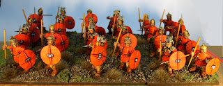
These are most of one legion's velites for our Zama project, painted (very nicely indeed) by Craig Davey; I really like what he has done with them! I gather he used a lot of vermillion.
The figures are the new velites from Aventine. They have 8 different poses so far, and I have heard on the grapevine that more are to follow. There are 3 different shield types (2 not shown here). One of the things I really like about Aventine is that is is possible to build large units where most or all of the figures are different from one another.
I'm currently finishing 32 Renegade velites, and unfortunately they aren't a patch on these. :-(
I'm currently finishing 32 Renegade velites, and unfortunately they aren't a patch on these. :-(

I'm not sure I like the sculpts. They make them look like little dumpy midgets (see figure on the far right at the front).
ReplyDeleteLol. I know that sounds a little harsh!
Nice paint work though.
*with disproportionate body parts
ReplyDeleteHi Consul, I think that may be because the shot is a little from above, and distorted because it is close to the camera and on the edge of the frame.
ReplyDeleteHowever it is true that Adam does go for relatively large feet and hands. Looking at these next to similar-height Copplestone-designed Romans, they are slightly larger. However I think the minis would mix in very nicely indeed with say the Foundry Caesarian Romans. In fact, I've been thinking of using the velites as levy legionaries in mixed units with the Foundrys, to get more variety of poses. Antesignani, anyone?
No thanks, I've just eaten ;-)
ReplyDeleteThe pseudo-Corinthian helmets are a nice touch and add a cool pre-Marian flavour. However, would have based them two on a 4x4cm square; makes them look more like actual skirmishers. But, as ever, personal taste.
ReplyDeleteCheers
SG
Hi SG, yes we are all following the DBx basing sizes, which look just a little cramped with today's bigger 28s.
ReplyDeleteI sometimes place only 3 figures, instead of 4, on a 6x6 base; this looks very effective and more irregular.
Do Renegade miniatures mix well with Aventine/foundry? I have WW1 German and they are big guys.
ReplyDeleteI like the orange light in the red color of tunics and shields.
Are you making the stands for all the project?
Renegade are VERY big. I wouldn't combine with other manufacturers in the same unit but I'd have no problem using them in a seperate unit but in the same army.
ReplyDeleteHi Einar,
ReplyDeleteI think Renegade and Aventine velites would just about mix within a unit, but I would just go with Aventines as better figures. I'm painting a big unit of Renegades because I had a load already painted to a basic standard, that would be relatively easy to "tart up".
I'm not making all the stands, but we are all basing to a common standard (DBx).
Hi Consul, yes Renegade are very big; Aventines are almost as large, though. There's not a lot in it!
ReplyDeleteSimon:
ReplyDeleteIs that fur wrapped around the helmets of some of them? Precursor to the types worn by Napoleonic cav maybe. Anyway fine painting and your forces are surely growing. Regards, Dean
Nicely executed. I like the shields a lot, although I might have mixed in some brown and neutral tunics just to tone down the monochromaticness of the unit. Is 'monochromaticness' a word?
ReplyDeleteHi Dean, alas this unit is not mine, but a mate's. The helmet details are fur; IIRC there is a reference in Polybius (?) that the velites distinguished themselves from each other so that their bravery could be seen.
ReplyDeleteHi AJ, my own velites (still on the painting table, but almost done), will be a much scruffier and less uniform bunch.
Hi. I should say that if the figures look short and dumpy, that's the fault of my camera work, not the figures! I took the shot to try and show the variety of figures in the unit; should have thought about the foreshortening resulting from this. Mea culpa.
ReplyDeleteWelcome watchthatflank!
ReplyDeleteI reckon you need to put the camera a little further back. But it's generally a great photo!